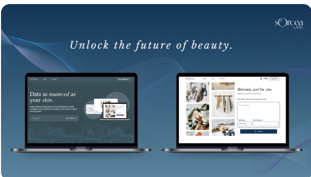
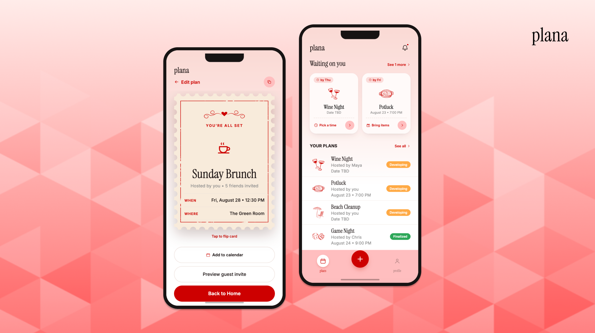
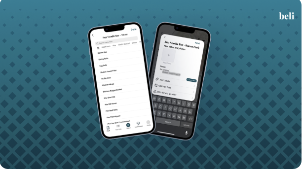
Common Strengths
- Strong content discovery
- Personalized recommendations
- Low-friction matching
- Interest-based communities
- High engagement
AI-Enabled Civic Tech Platform
Problem
Social platforms optimize for engagement over understanding, so users needed to trust a fundamentally different interaction model built around constructive disagreement.
Founder
1 UI/UX Designer
3 Engineers
UI/UX Designer,
Advisory Board Member
Feb 2026 – Current
Pre-Launch
Key Outcome
I replaced an explanation-heavy onboarding with a single AI practice conversation that teaches constructive dialogue through use rather than instruction.
Result: ~50% fewer onboarding steps, with users reaching the platform's core value faster.
What I Drove
Project Dialogue is an emerging civic-tech platform rethinking how digital systems shape connection in an age of polarization. As Product Designer and Product Strategy Advisor, I translated a broad social-impact mission into MVP user flows, practice-first onboarding, responsible AI coaching concepts, and a visual identity for a new kind of digital public space.
You are now viewing:
01 Solution
Our first iteration.
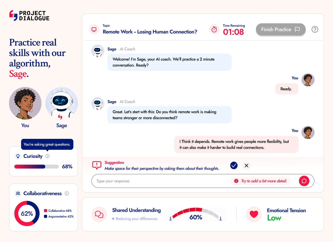
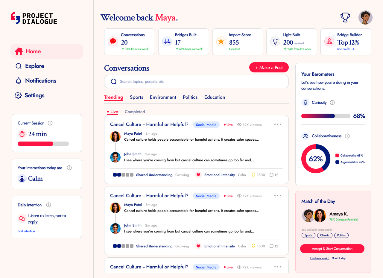
Bold and unforgettable, but also timeless and chic. Every typographic and color decision was made to preserve that balance.
02 Research




I analyzed social media and match-making apps to find gaps in how platforms support cross-perspective connection.
of Facebook content comes from like-minded sources
of U.S. adults have personally experienced online harassment
say political discussions online are less respectful than in-person
Key Research Finding
The competitive analysis showed that the issue was not just content moderation. The deeper problem was interaction design: existing platforms reward attention, reaction, and similarity more than thoughtful exchange. That gap is what Dialogue was built to fill.
03 Ideation
The original onboarding was built around a real need: before entering the platform, users had to understand a completely new model for constructive disagreement. But as I mapped it out, I felt the process was too long and added too much friction before users could experience any real value.
Sign up and share initial perspective
Questionnaire to personalize experience
Educational modules
3 guided conversations with other users
Enter main platform feed
How might we introduce users to a completely new conversation platform and its unique interaction model without overwhelming them with lengthy explanations?
I shortened onboarding by replacing educational modules and matched conversations with a single, low-commitment AI mock conversation, giving users an early, practical feel for constructive dialogue and their own communication style.
Practice-First Onboarding
Reduced planned onboarding steps by about 50%
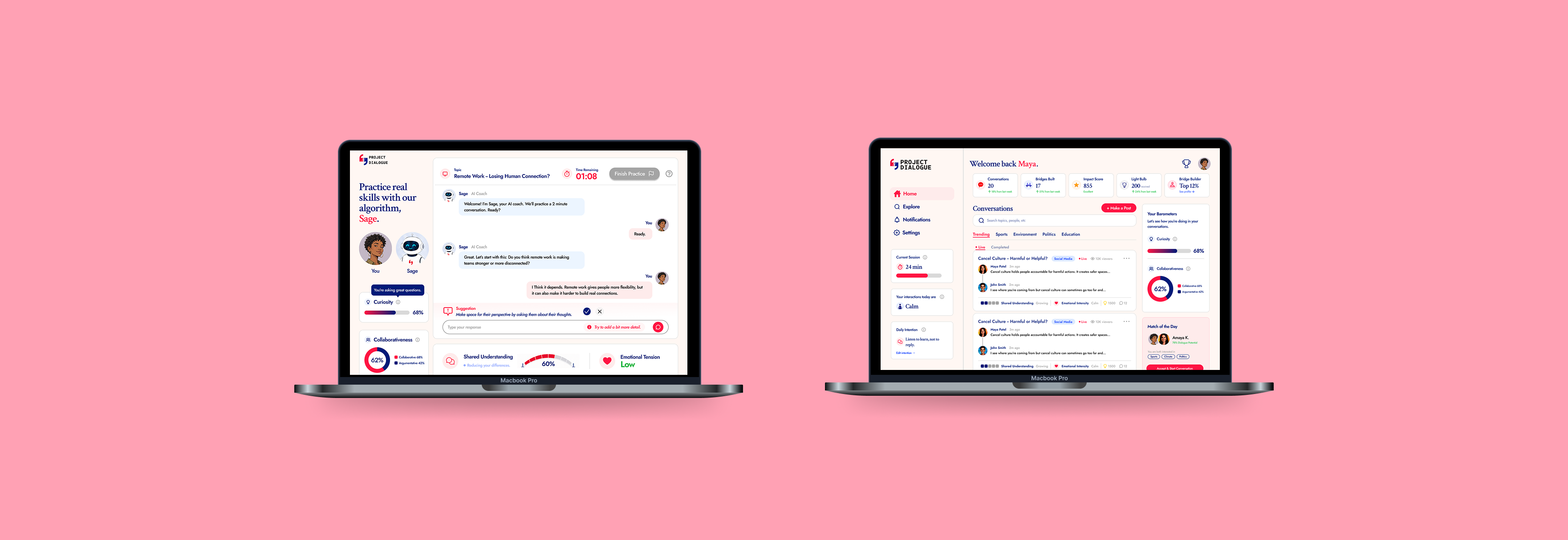
The founder wanted rich, real-time engagement feedback with multiple suggestions. I preserved that goal but simplified the execution, reframing the metrics around growth instead of judgment and cutting three competing suggestions down to one.
After the onboarding process was set, I shifted my focus to what the AI mock conversation screen would actually look like. The founder had a clear vision for the features she wanted to include, making sure users were aware of how they were engaging. I wanted to preserve her goal, but also make sure we were designing for cognitive load.
I brought in Claude Design to quickly turn the founder's direction into a visual mockup. It let me iterate faster and show her what she was describing so we could visualize it together before collecting feedback and revising it.
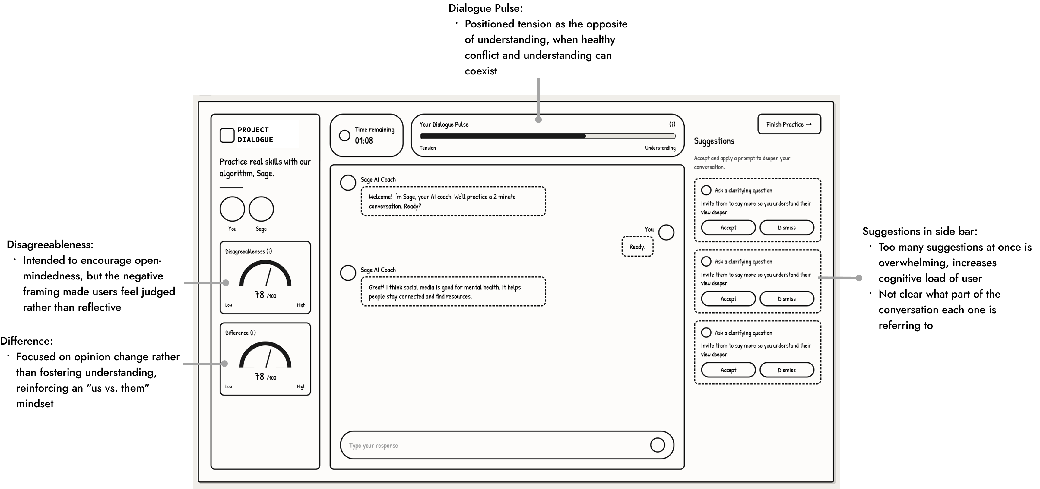
The barometers risked shifting focus from understanding to changing minds, and three competing suggestions pulled focus from the conversation itself.
Psychology and CS experts agreed: reframe the meters around growth, not judgment, and cut to one suggestion.
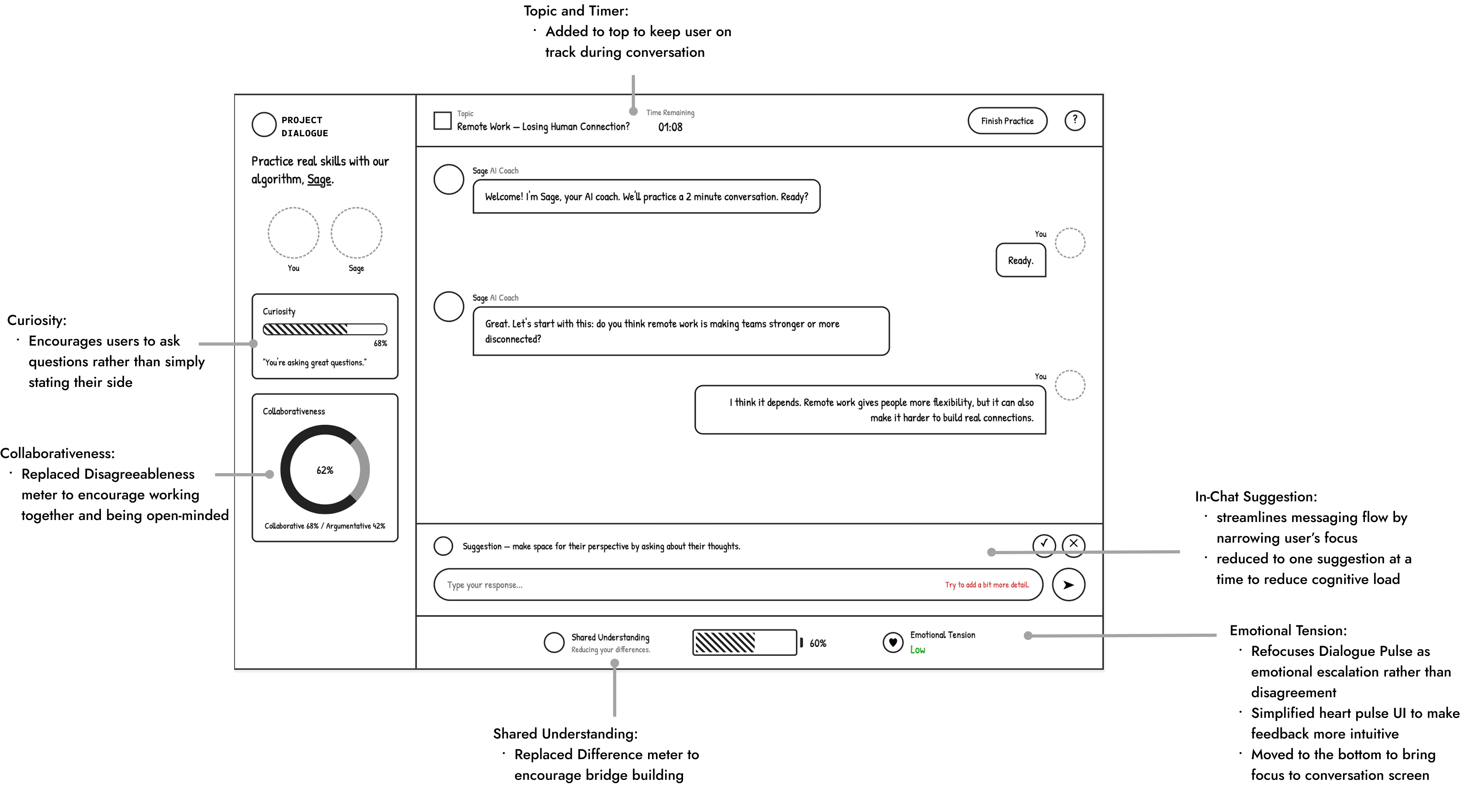
Shifted metrics to emphasize Curiosity, Collaborativeness, and Shared Understanding, and simplified guidance into a single in-line prompt.
Once users complete onboarding, they enter the main platform. These three features work together to reinforce our core goals of safe, healthy, and meaningful conversations, helping users engage thoughtfully and stay in control.
Update in real time after each new conversation to reflect how open and collaborative your engagement has been.
How long have users been on the platform and are they healthily engaging?
Connecting users with people that other algorithms would've never paired with them, based on difference rather than similarity.
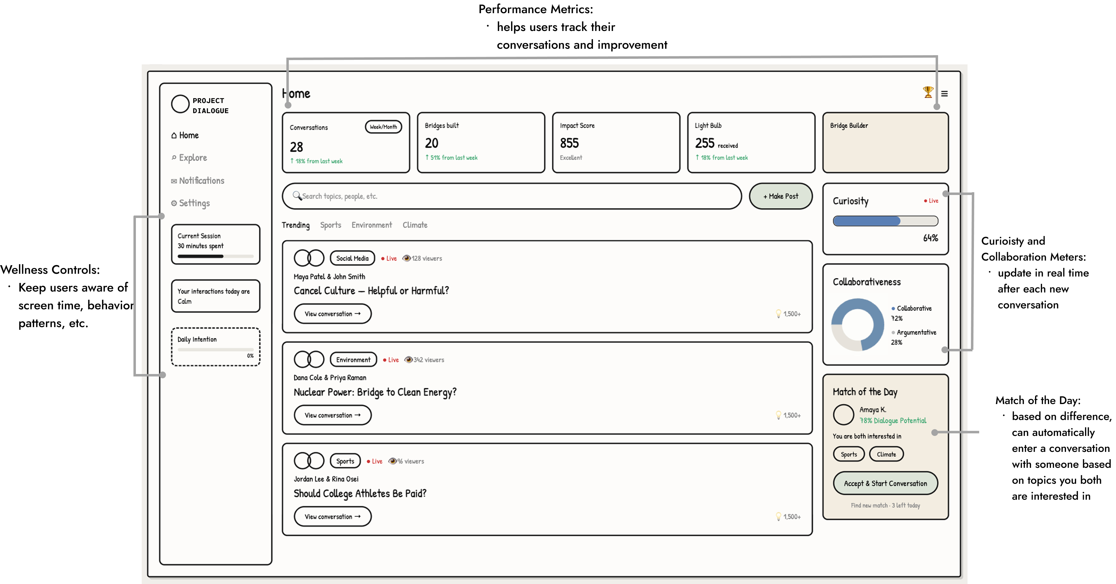
Here's the full picture: each stakeholder's need, and what I designed in response.
04 Impact
Project Dialogue is pre-launch, so impact is still projected, but the research makes the opportunity clear. We're not just building another social app. We're designing against the patterns that made social media toxic in the first place.
Cross-perspective matching, not feed-driven similarity
Structured flows and AI moderation for civil disagreement
Dialogue skills that carry over on and off the platform
Beta metrics, anchored to our three product goals:
05 Next Steps
06 Reflection
The hardest part of this project wasn't designing individual screens, it was shaping a new conversation system, balancing AI guidance, user autonomy, transparency, and trust. I also learned to balance my own design decisions around user needs with the founder's vision, since she wanted to stay true to her original idea and I wanted to honor that while still finding ways to protect retention. It taught me how to make product decisions with incomplete information, and how much faster iteration gets when AI tools like Claude Design enter the workflow early.
back to top ↑